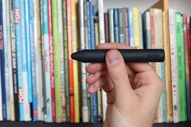
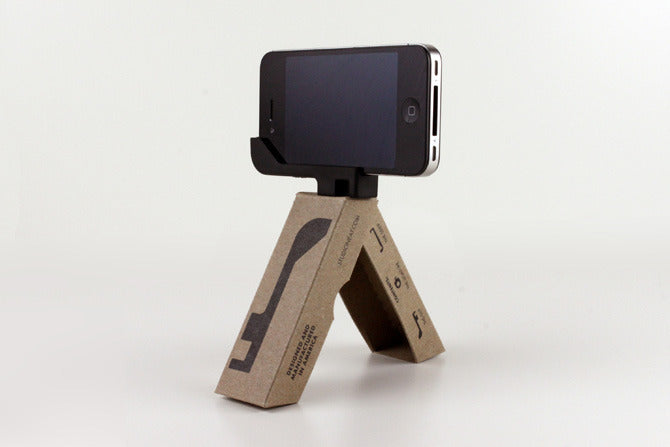
I had owned a glif. I say had, because I seem to have lost it somewhere. It’s probably the same place that my son’s missing car or an old retainer are. So I bought a new one. And, while I was on Studio Neat’s website, I figured I’d just drop some more money. And I’m probably not done.
One of the most beautiful things about both of these products, really, is the design of the packaging. Each of their packages eschews bright colors and plastic forms for simple, sustainable brown paper and black ink.
I can forgive their use of Futura, since they apologize on their glif video to Wes Anderson for blatantly ripping him off. Although, you could say Anderson ripped off Kubrick. Not sure who Kubrick ripped off, but it’s someone, I’m positive.
The glif+ package evokes typography (as do the names for the glif accessories, the serif and ligature – I see what you did there…) and is ingenious for not only the superbly-designed products within, but the double-use as a tripod, albiet a crappy one. Seriously, I bet this thing disintegrates after three uses, but it’s still a sweet marketing idea, nonetheless.
The Cosmonaut packaging is equally cool. It seems to evoke a Russian-cool (the faux-cyrillic “N” is an obvious but effective touch) without screaming Constructivist. It actually has a retro-child’s toy feel to it, harkening to the metal toy days. The interior of the package even has wings adjacent to the nested stylus, creating a rocket shape.
The Cosmonaut itself looks too fat. It looks like it shouldn’t work. That’s the problem with styli on tablets, anyway – since you can’t rest your hand on the surface, it feels like writing in air. But considering the Cosmonaut is supposed to feel like a dry erase marker (which forces you to air-write anyway) it… works.
Two guys in a garage (apartment) seems to work. I need to try it sometime.


